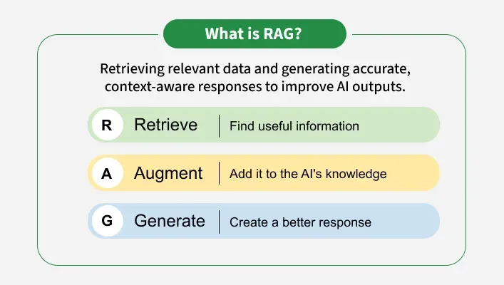
The srcset attribute lists multiple versions of the same image at different widths, letting the browser choose the best one for the visitor's actual screen — the core mechanism behind responsive images.
Syntax
<img src="fallback.jpg" srcset="small.jpg 480w, medium.jpg 800w, large.jpg 1200w" alt="...">Basic Example
<img
    src="thumbnail-800.jpg"
    srcset="thumbnail-400.jpg 400w, thumbnail-800.jpg 800w, thumbnail-1600.jpg 1600w"
    sizes="50vw"
    alt="Course thumbnail"
>
Browser output: only ever one image is actually downloaded and shown — but which one depends on the visitor's device, invisible in the rendered page itself.
How It Works
- Each entry in
srcsetpairs an image URL with a width descriptor (like800w), stating the image file's real, actual pixel width. - The browser combines this with the
sizesattribute (how large the image will display) and the device's pixel density to pick the smallest sufficient file. srcremains as a required fallback for older browsers that don't understandsrcsetat all.
Important Attributes
| Attribute | Purpose |
|---|---|
srcset | Comma-separated list of url widthw pairs |
sizes | Tells the browser the image's expected rendered width per viewport condition |
Real-World Example
<img
    src="student-project-800.jpg"
    srcset="
        student-project-400.jpg 400w,
        student-project-800.jpg 800w,
        student-project-1200.jpg 1200w
    "
    sizes="(max-width: 700px) 100vw, 700px"
    alt="A student's completed portfolio website project"
>
On a phone narrower than 700px, the image displays at full viewport width; on any wider screen, it's capped at 700px — the browser uses that information to pick the right file from srcset.
Common Mistakes
- Using
xdescriptors (pixel-density, like2x) andwdescriptors (width) inconsistently within the samesrcset— they're two different systems and shouldn't be mixed together - Forgetting the fallback
srcattribute
Best Practices
- Provide at least 3 meaningfully different widths for any large, important image
- Keep
sizesaccurate to how the image actually renders in your CSS layout
Accessibility Considerations
No direct accessibility effect — alt still applies to whichever image file is actually chosen and displayed.
SEO Considerations
Smaller, appropriately-sized downloads directly improve page-speed metrics that search engines factor into ranking, particularly for mobile search results.
Browser & Modern HTML Notes
Universally supported in modern browsers; older browsers that don't recognize srcset simply fall back to the plain src attribute, so it degrades gracefully.
Mini Practice
- Write a
srcsetwith 4 width-based candidates for a product photo. - Explain the difference between a
wdescriptor and anxdescriptor in your own words.